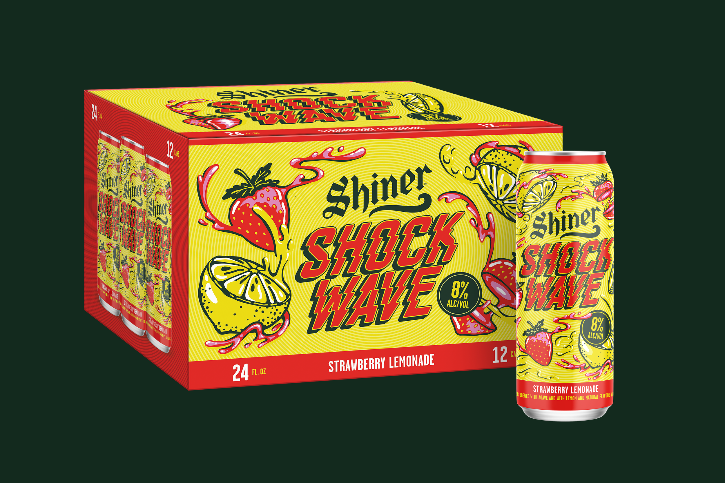
Shockwave
Packaging / Brand Identity / Art Direction / Production Collaboration
©️2025
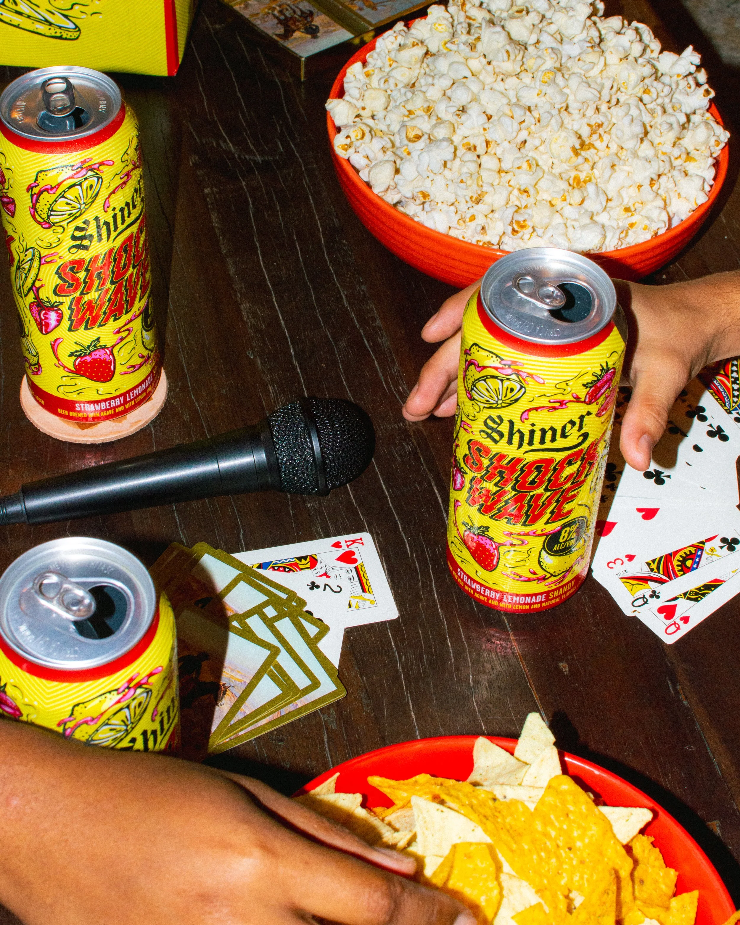
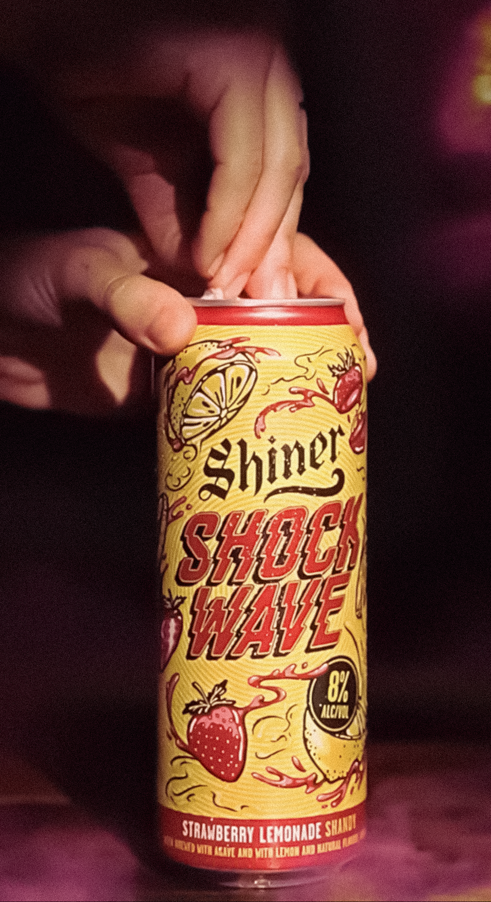
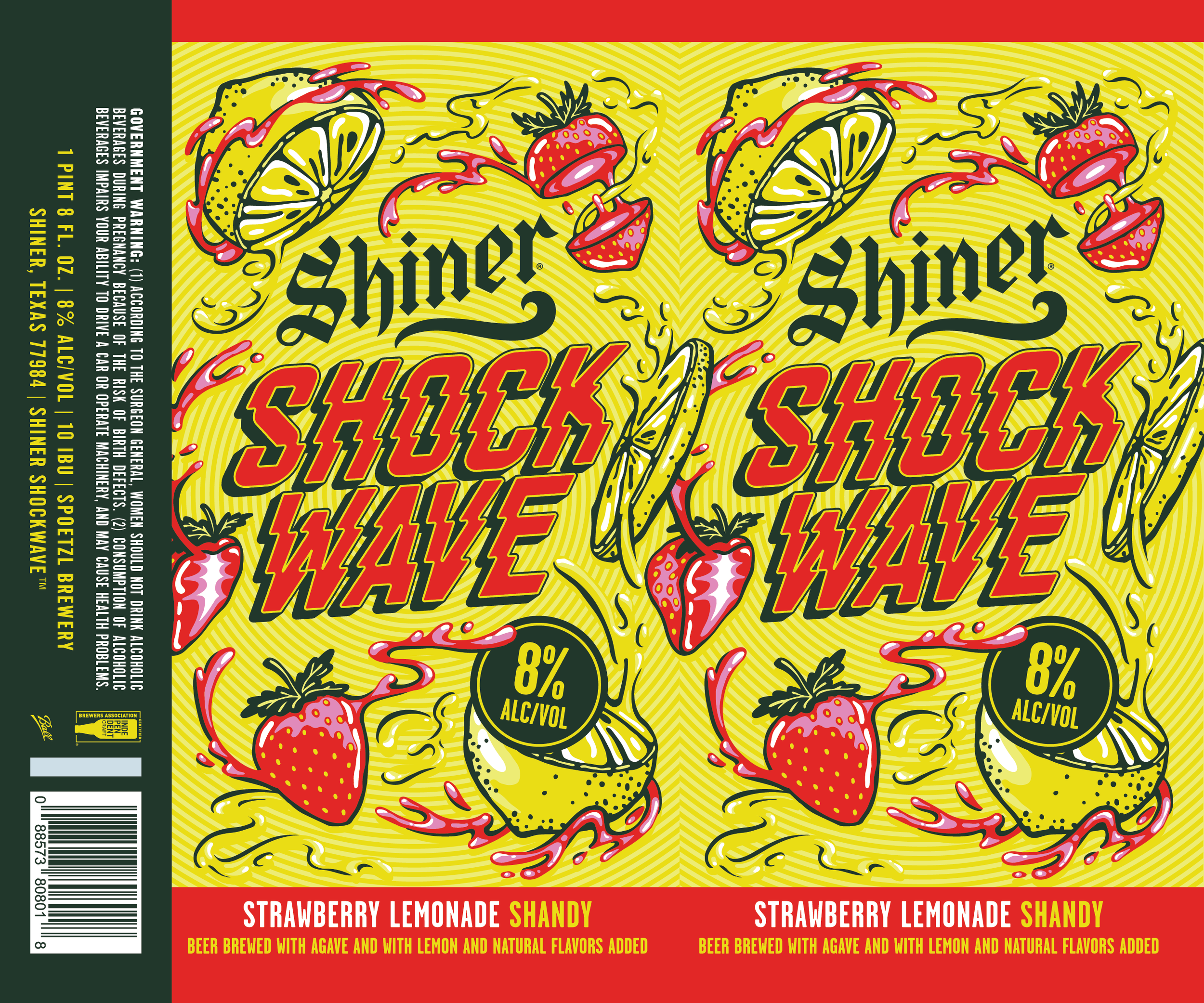
Designed the packaging for Shiner Shockwave, a bold new line of supercharged shandies created to bring vibrant flavor and high energy to the convenience store aisle.
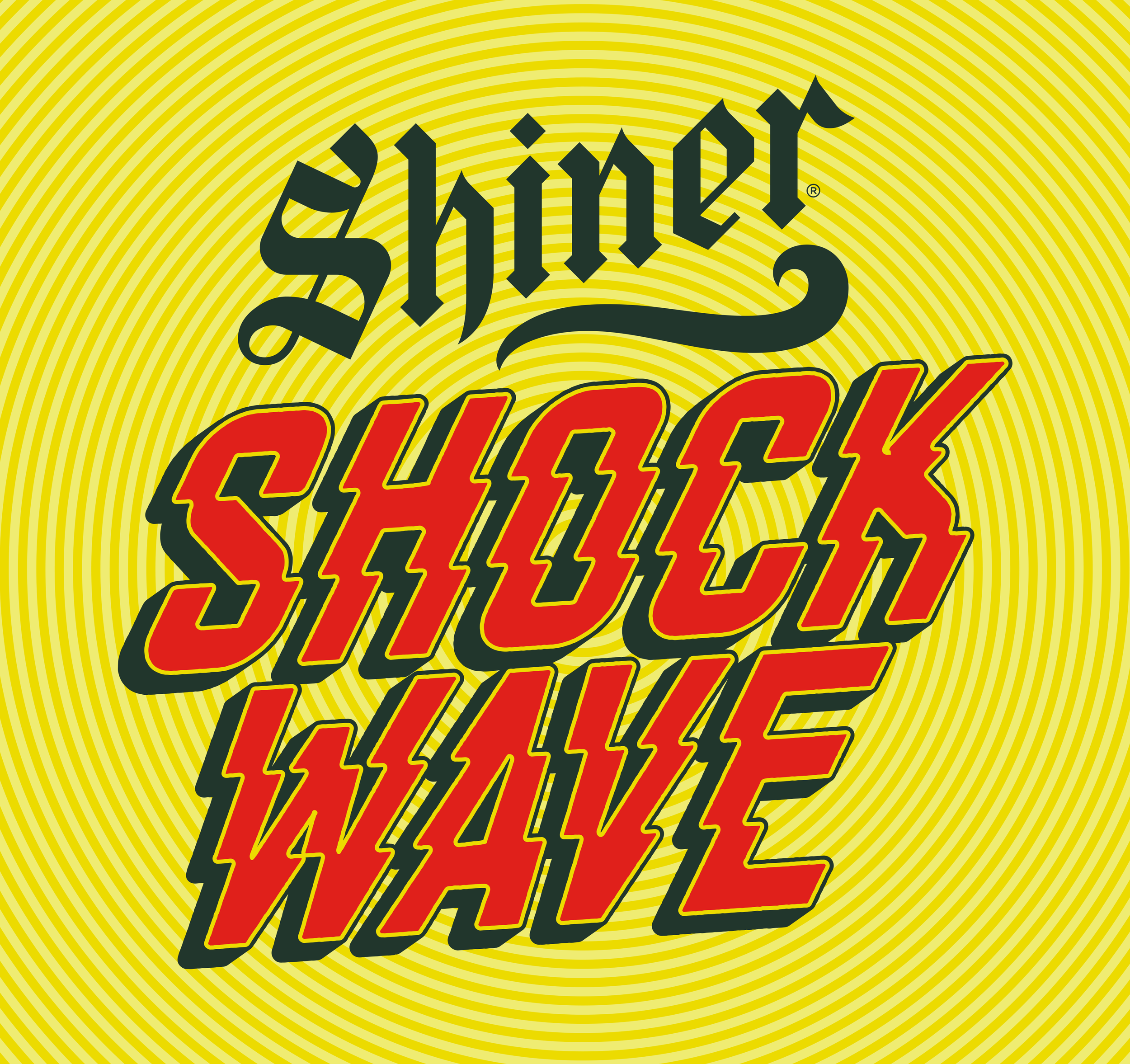
The approach centered on capturing the product's explosive personality through expressive illustration, electric color, and dynamic movement. Hand-drawn fruit elements and energetic splashes surround bold typography, creating a sense of motion that mirrors the bright, punchy flavor profile inside the can.
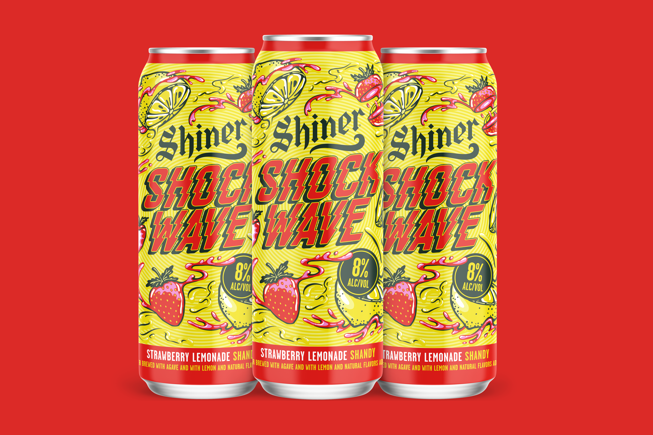
The visual system balances Shiner's established heritage with a more playful and contemporary attitude, allowing Shockwave to stand apart within the portfolio while remaining unmistakably Shiner. Designed specifically for the fast-paced C-store environment, the packaging emphasizes bold shelf impact and instant recognition.
The result is an energetic, flavor-forward identity that feels loud, refreshing, and impossible to ignore. Shiner has since expanded this line to multiple flavor options including Blue Razz Lemonade, Cherry Limeade, and Mango Lemonade, all using the same established design system.
Team: Morgan Unroe (Design Lead), Elis Klein (Illustrator), Kaitlyn Toney (Production Designer)