The Cocktail Collection

Brand Refresh / Visual Identity / Icon System Development
©️2026
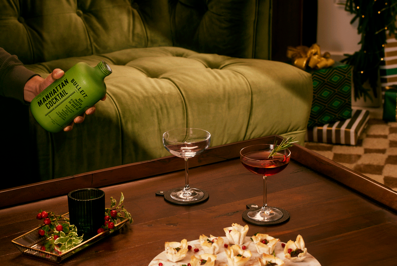
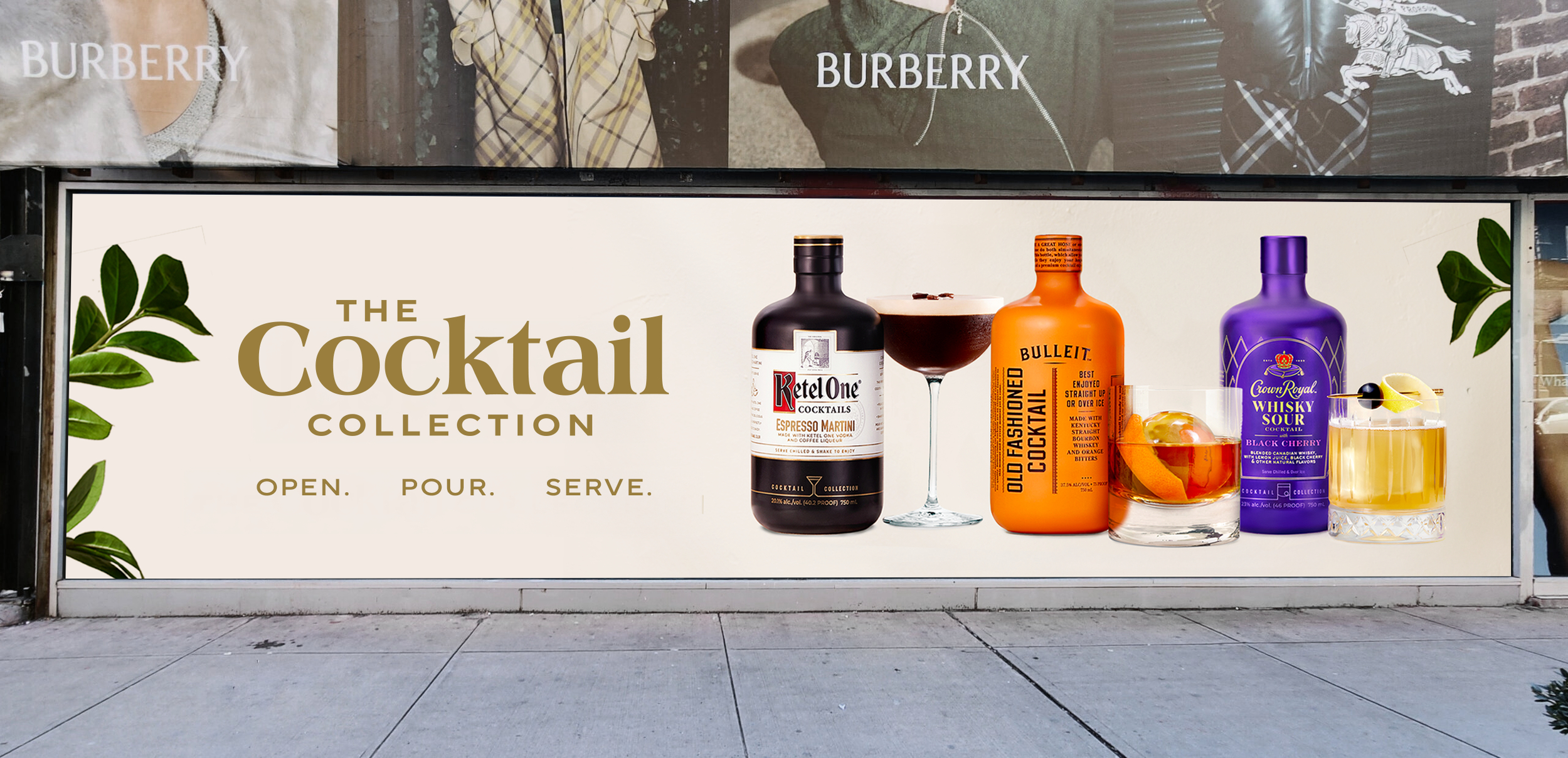
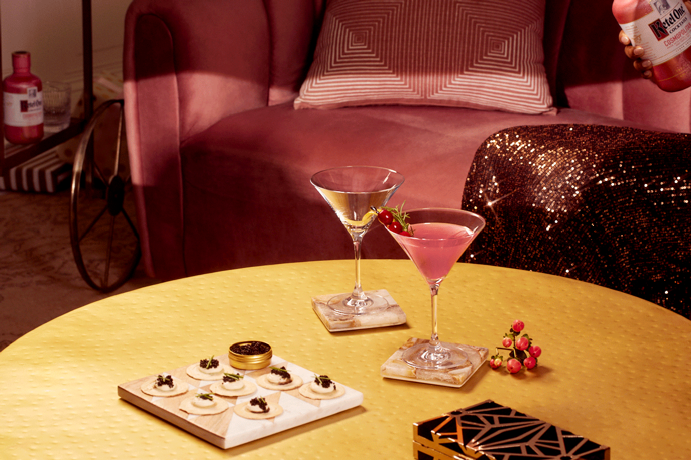
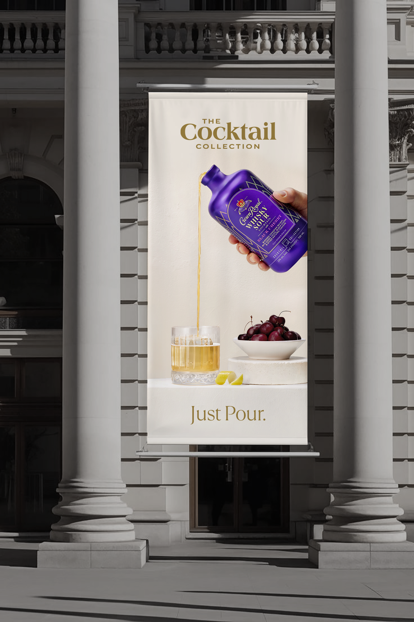
The Cocktail Collection offers a curated line of premium cocktail mixers and bar essentials designed for those who appreciate elevated experiences at home. I led the brand refresh, evolving the identity to feel more contemporary and refined while preserving the sense of luxury and indulgence that had become central to the brand.
As the portfolio expanded, the existing visual system began to feel dated and lacked the sophistication expected of a premium offering. The refresh focused on elevating the brand's most recognizable elements through more intentional typography, a refined color palette, and a cleaner compositional approach that emphasized clarity, balance, and craftsmanship.
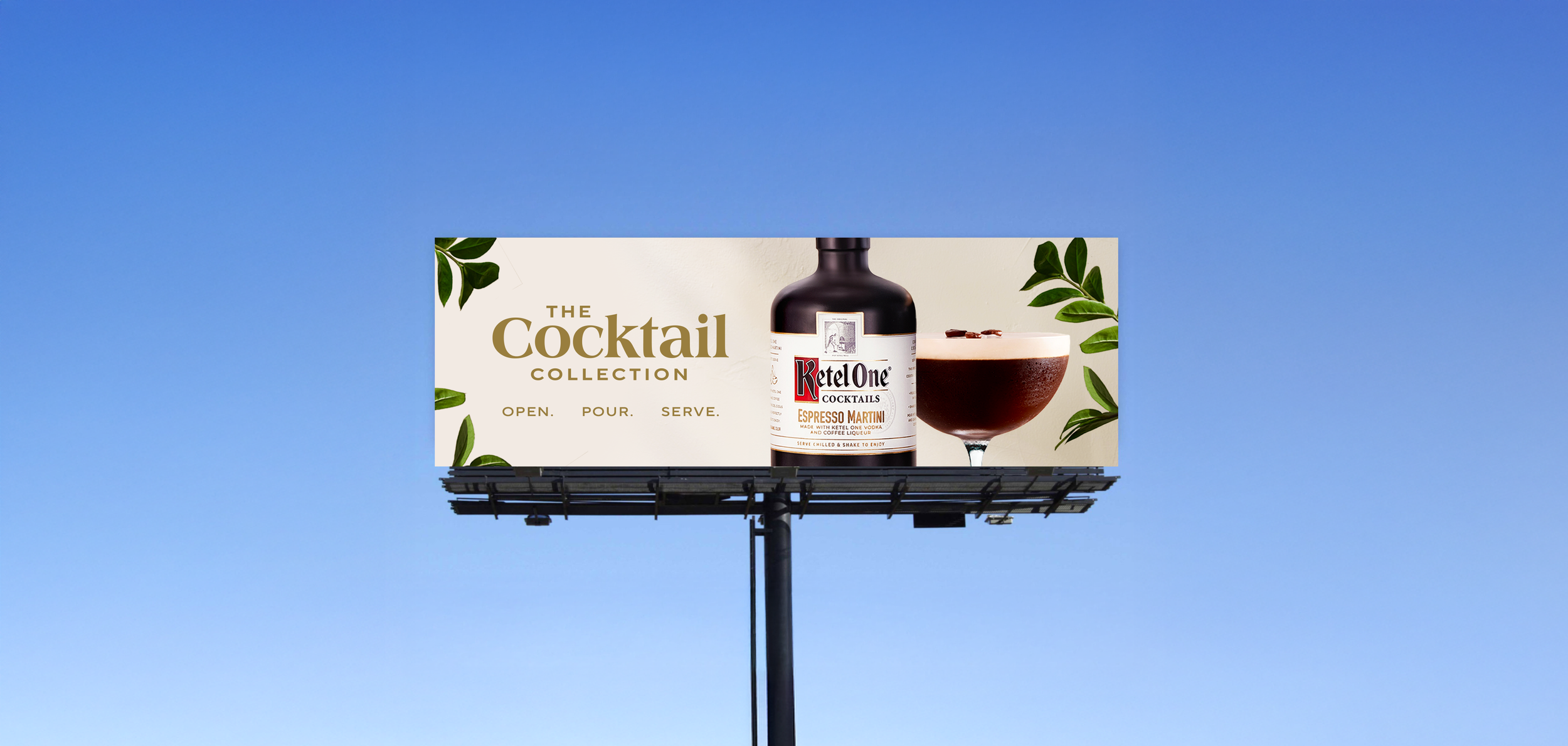
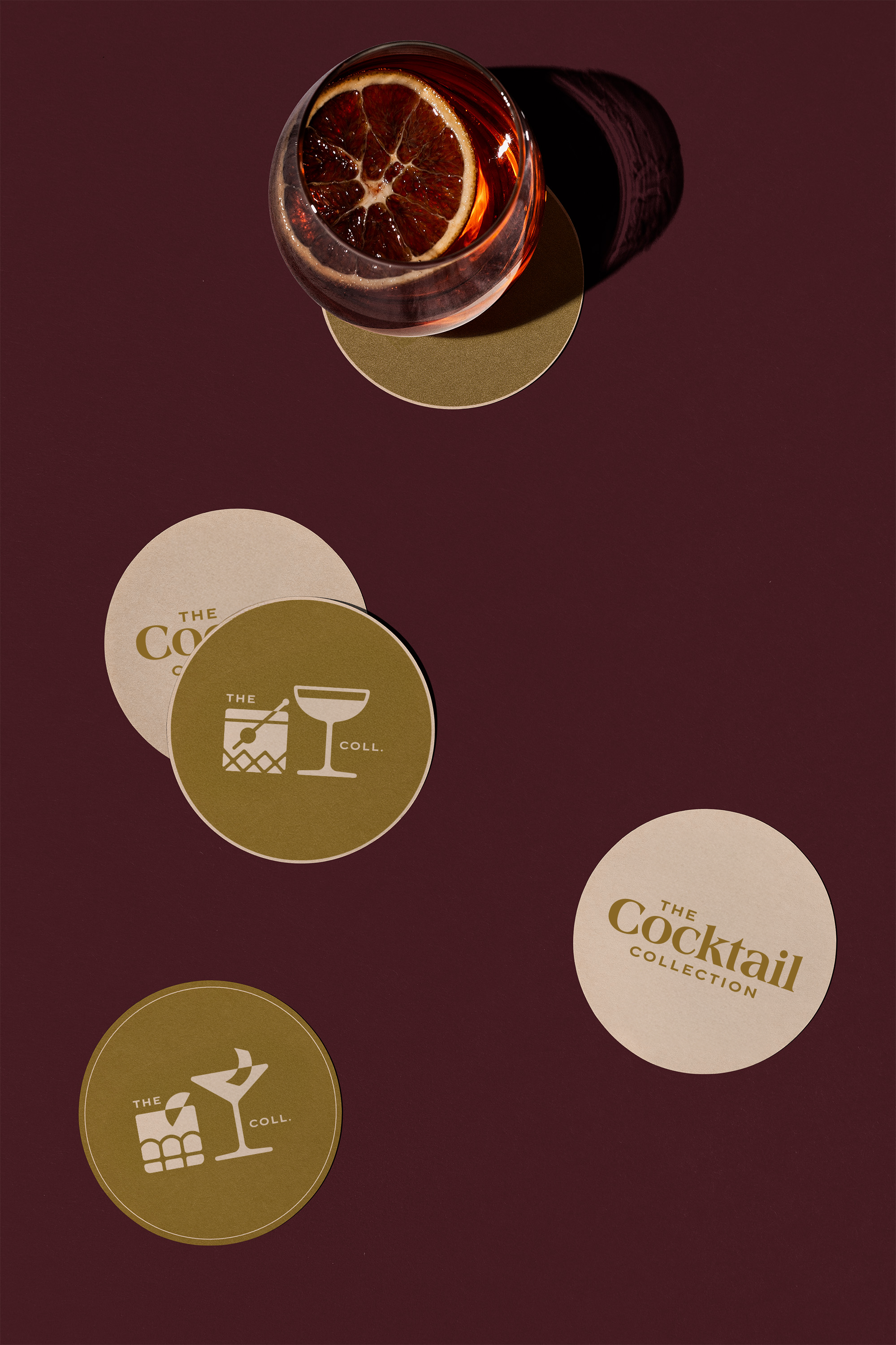

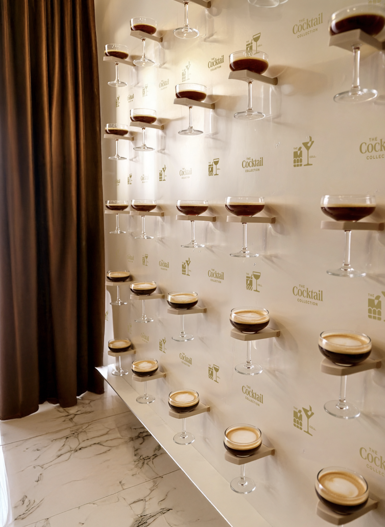
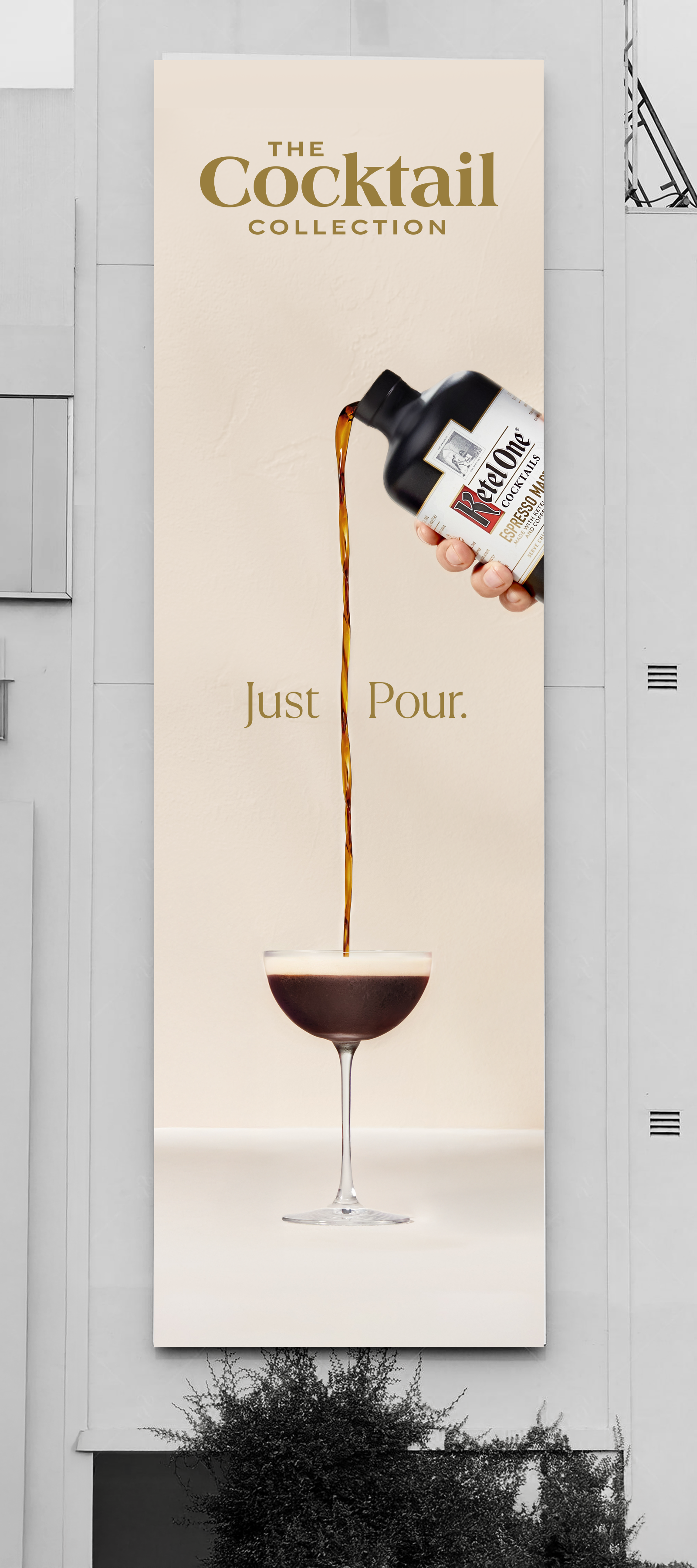
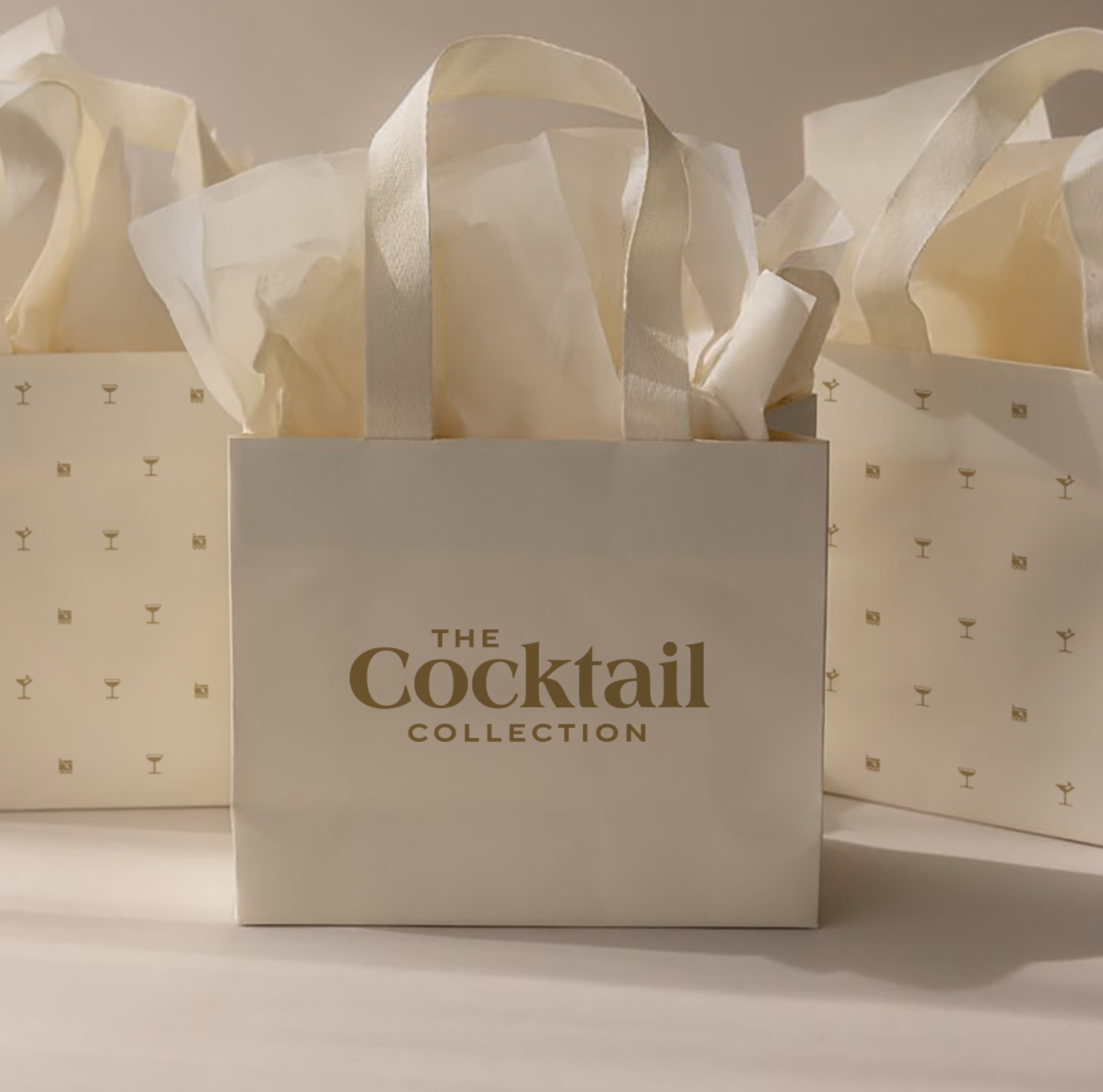
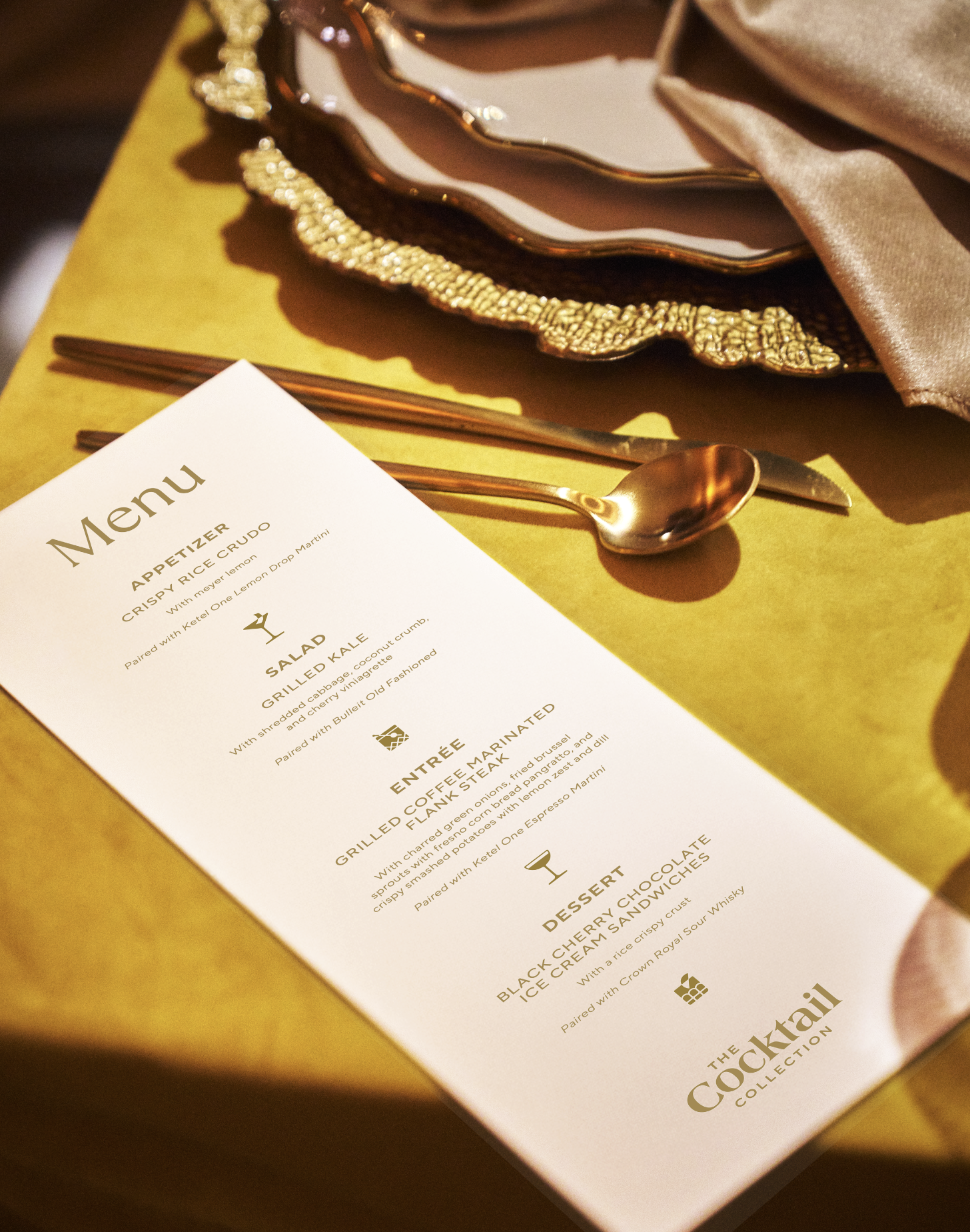
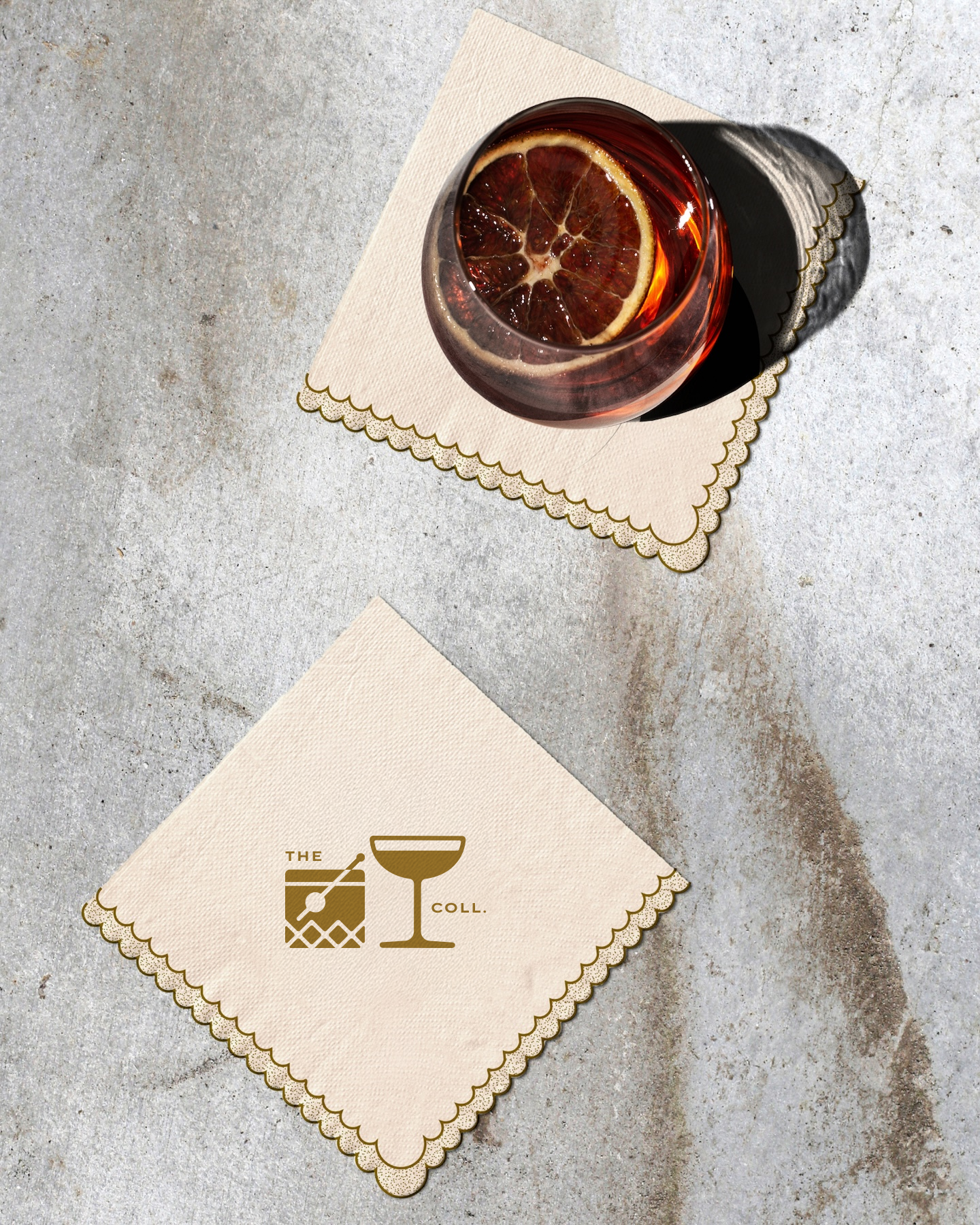
A key component of the redesign was the development of a new suite of brand icons, created to bring greater consistency and cohesion across packaging, digital, and marketing touchpoints. These elements helped establish a more ownable visual language while reinforcing the brand's elevated, detail-oriented aesthetic.
The resulting identity balances modern restraint with thoughtful embellishment, creating a system that feels polished, timeless, and approachable while allowing the products themselves to remain the focal point. Through subtle refinements and a renewed emphasis on craftsmanship, the refresh positions The Cocktail Collection for continued growth while strengthening its presence within the premium beverage space.
Since the redesign, the brand has evolved from Shiner Light Blonde to simply Shiner Light, with the visual identity remaining largely intact. Today, it continues to be one of Shiner's flagship offerings, distributed across the United States and Mexico and prominently featured throughout Texas in retail environments, advertising, and live events.