Prickly Pear
Packaging Design / Visual Identity / Illustration / Production Collaboration
©️2023
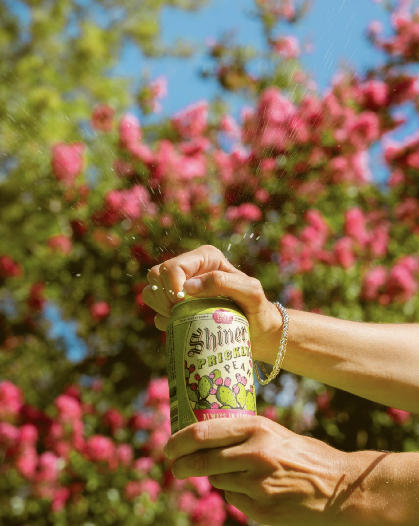
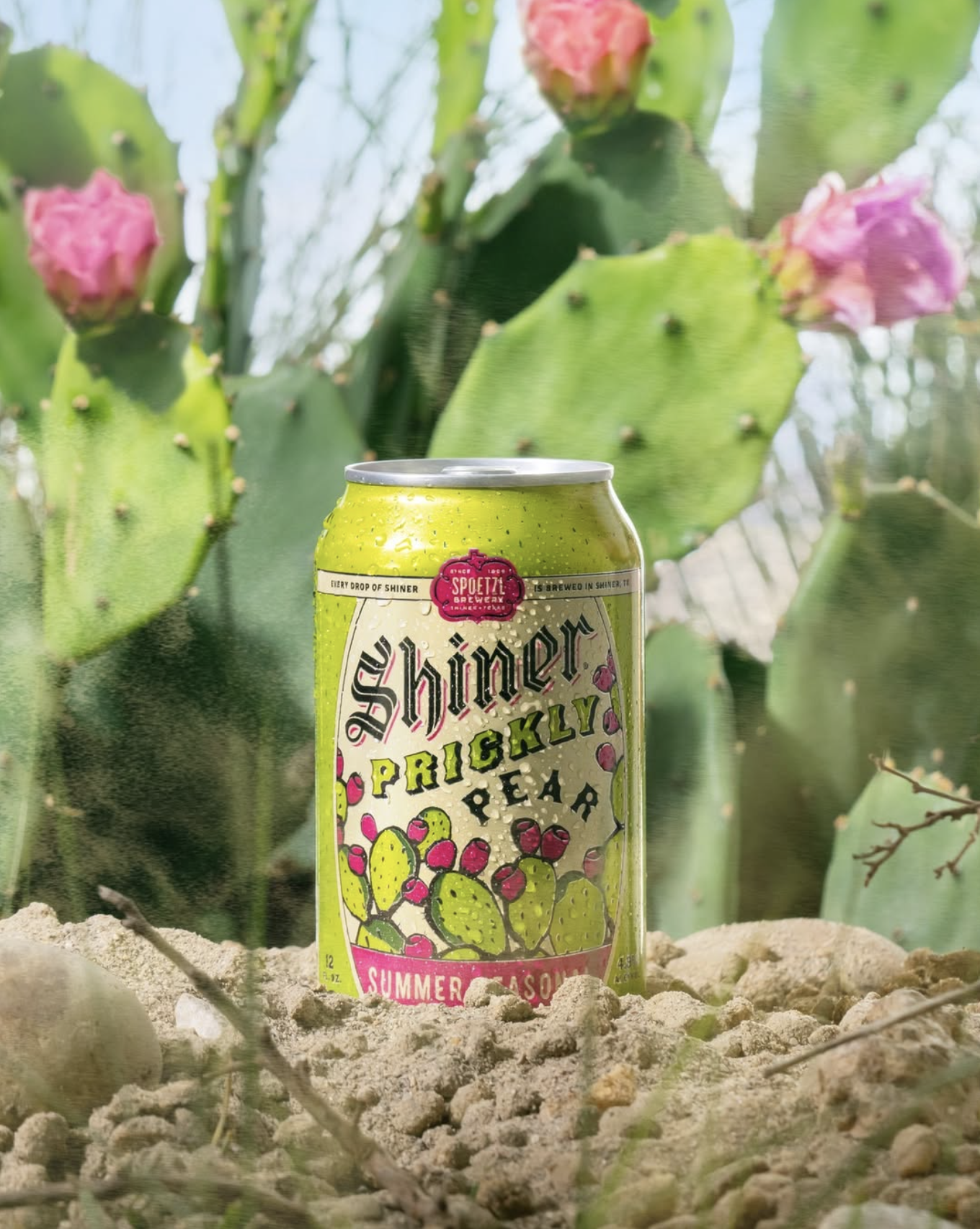
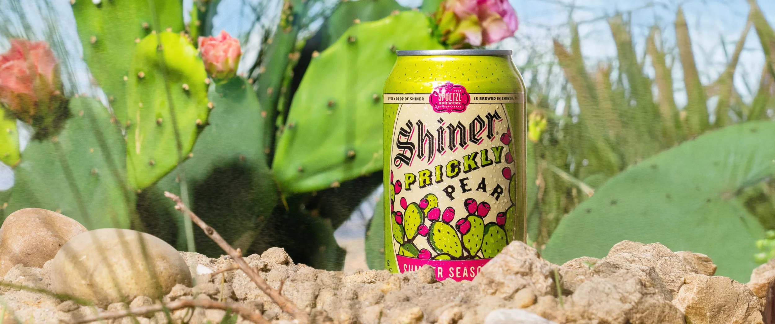
Shiner Prickly Pear has long been a fan-favorite seasonal release, known for its vibrant flavor profile and unmistakable Texas character. I led the redesign of the brand, reintroducing the beer through a refreshed, heritage-driven lens that celebrated its history while giving it renewed energy on shelf.
Rather than pursuing a more contemporary aesthetic, the approach embraced Shiner's legacy; drawing inspiration from vintage beer graphics, expressive typography, and the handcrafted charm that has defined the brewery for generations. At the center of the design is a bold, colorful illustration that captures the bright, refreshing character of prickly pear while creating a memorable and highly ownable visual identity.


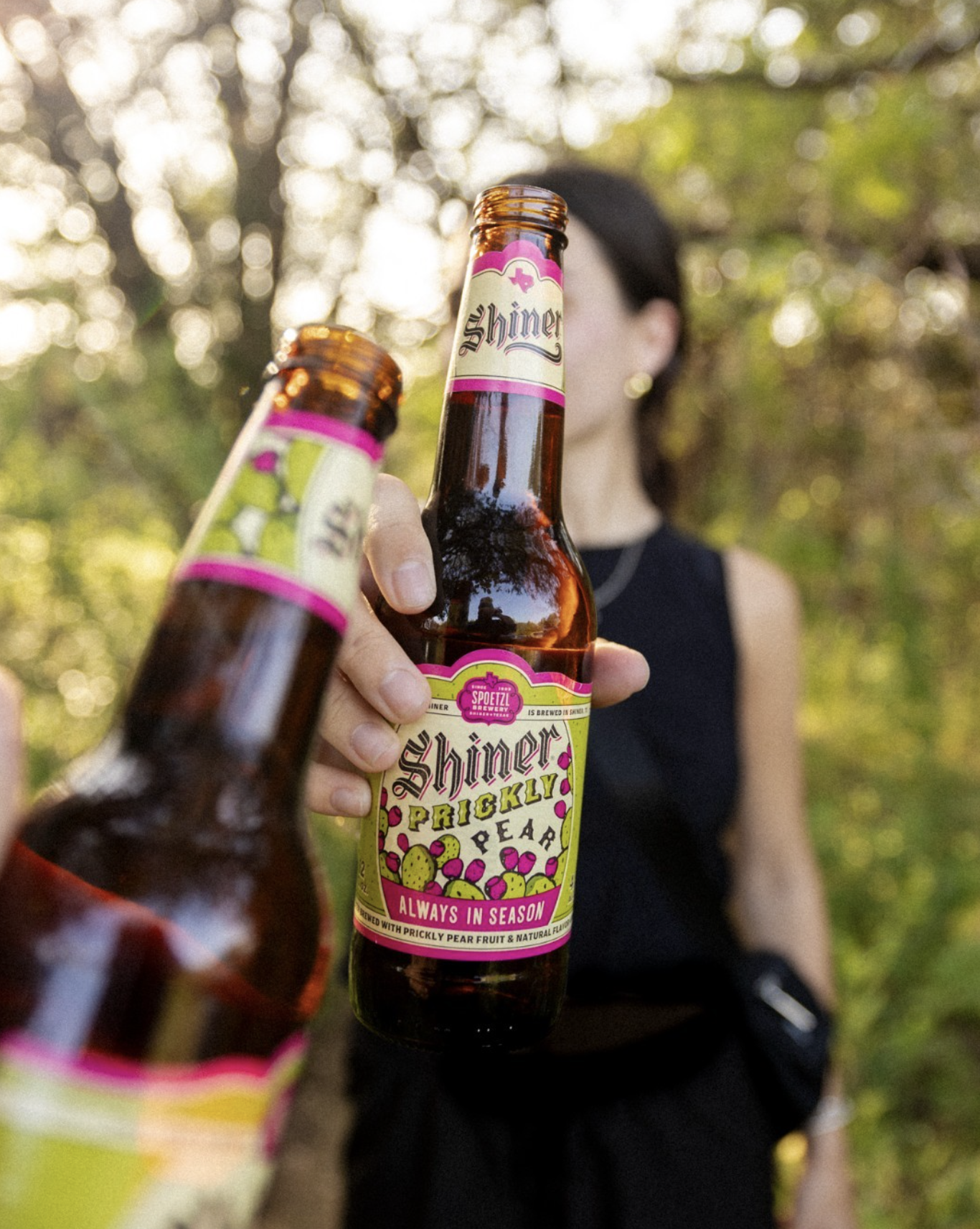
The resulting packaging feels nostalgic yet lively, balancing heritage cues with a more refined execution that strengthens its presence within the broader Shiner portfolio. The redesign was paired with a supporting social campaign aimed at re-engaging loyal fans and building excitement around the return of a beloved seasonal offering.