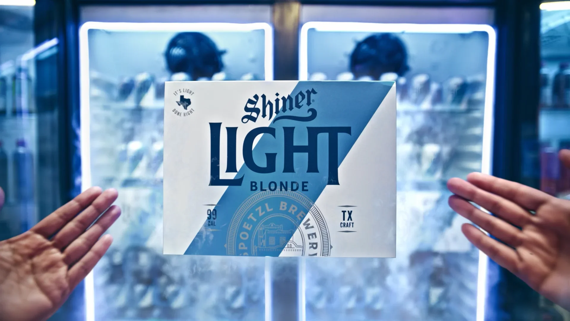
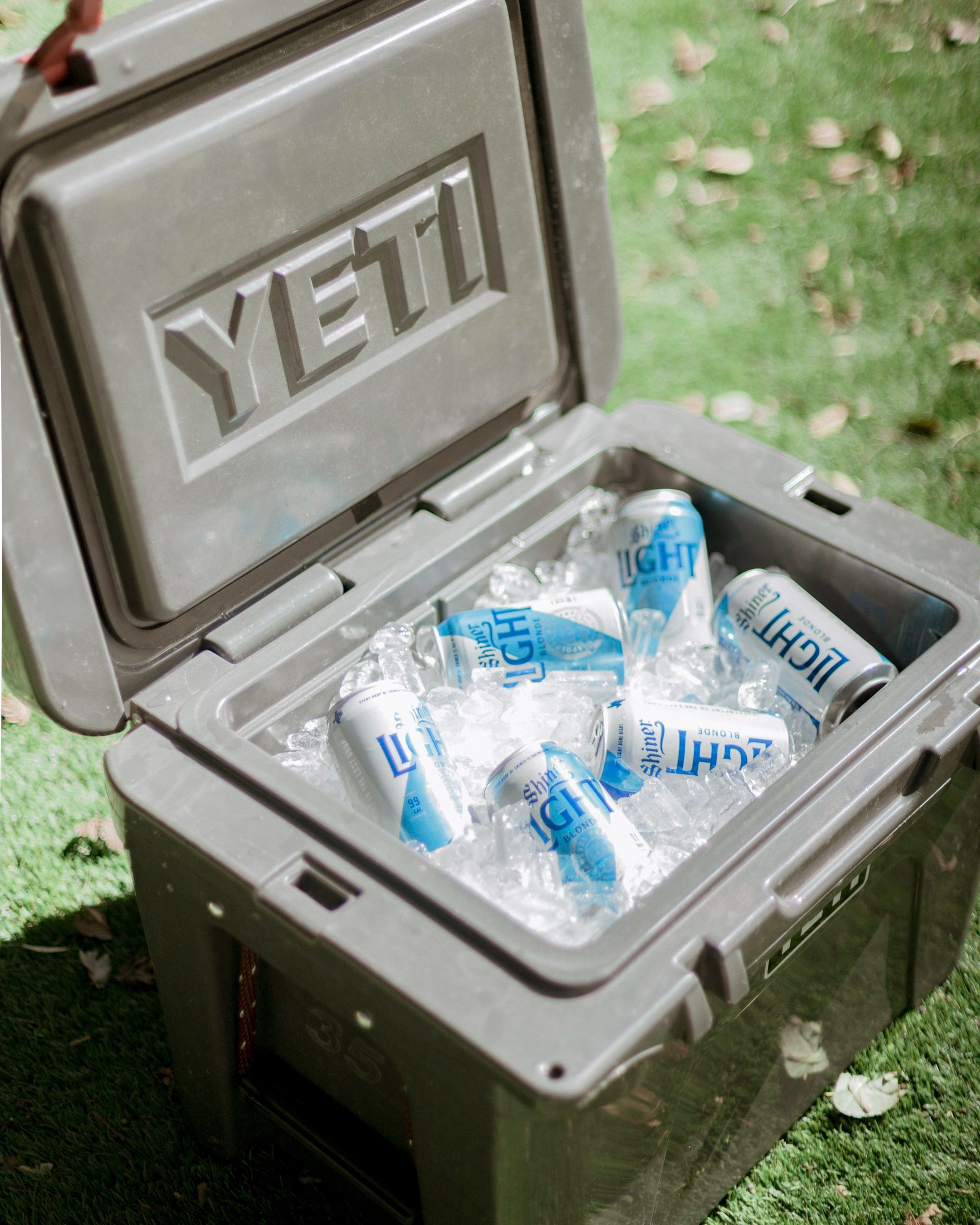
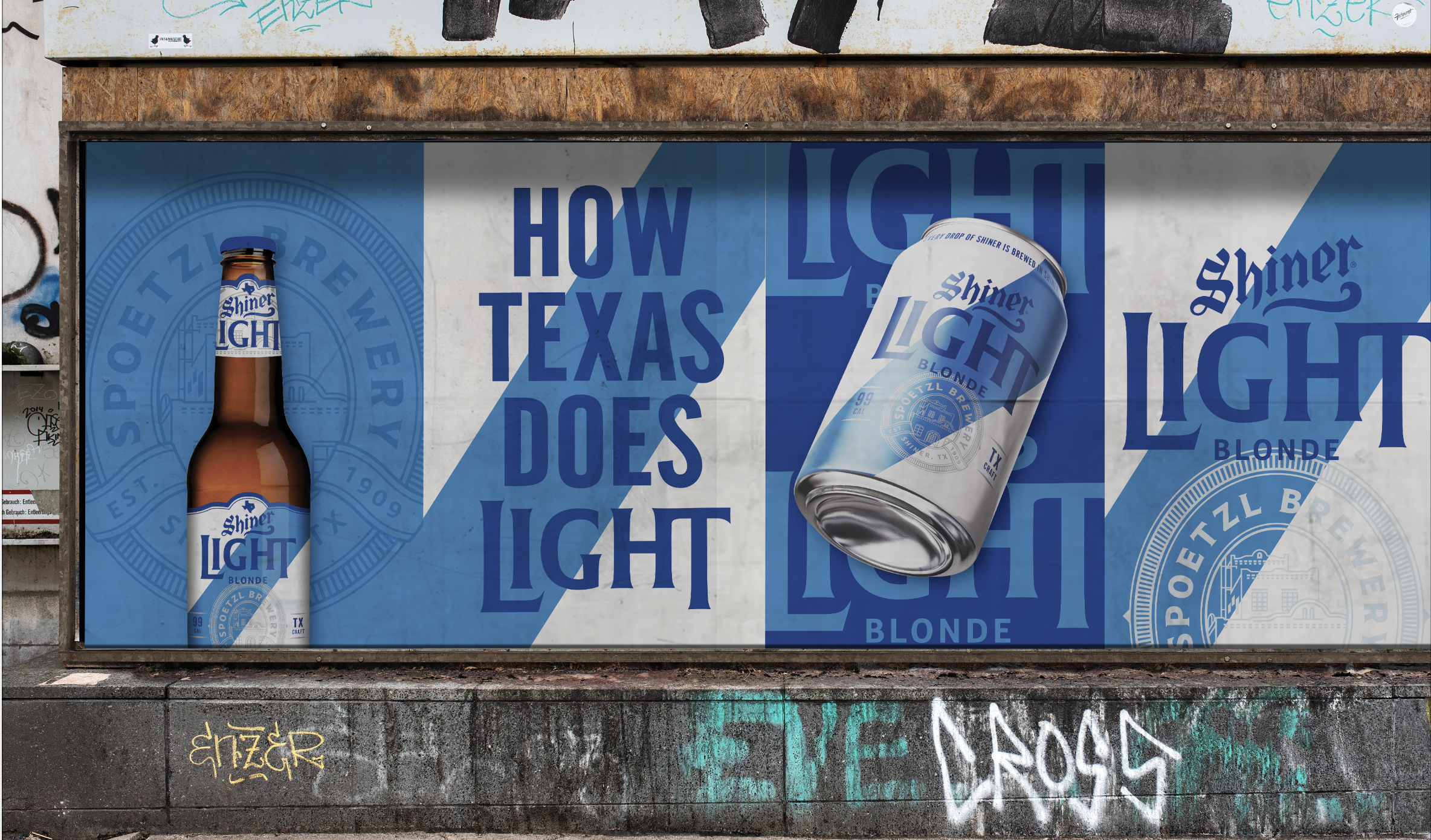
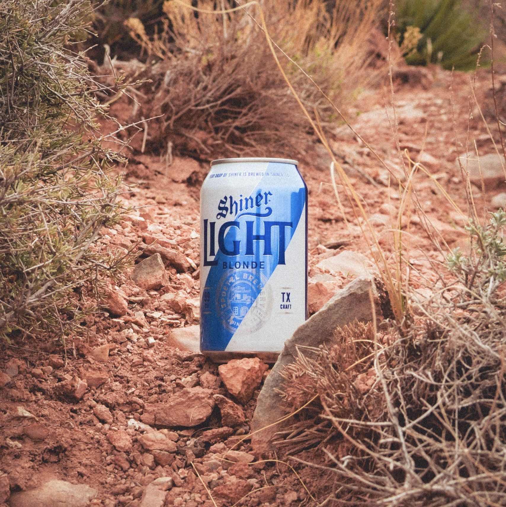
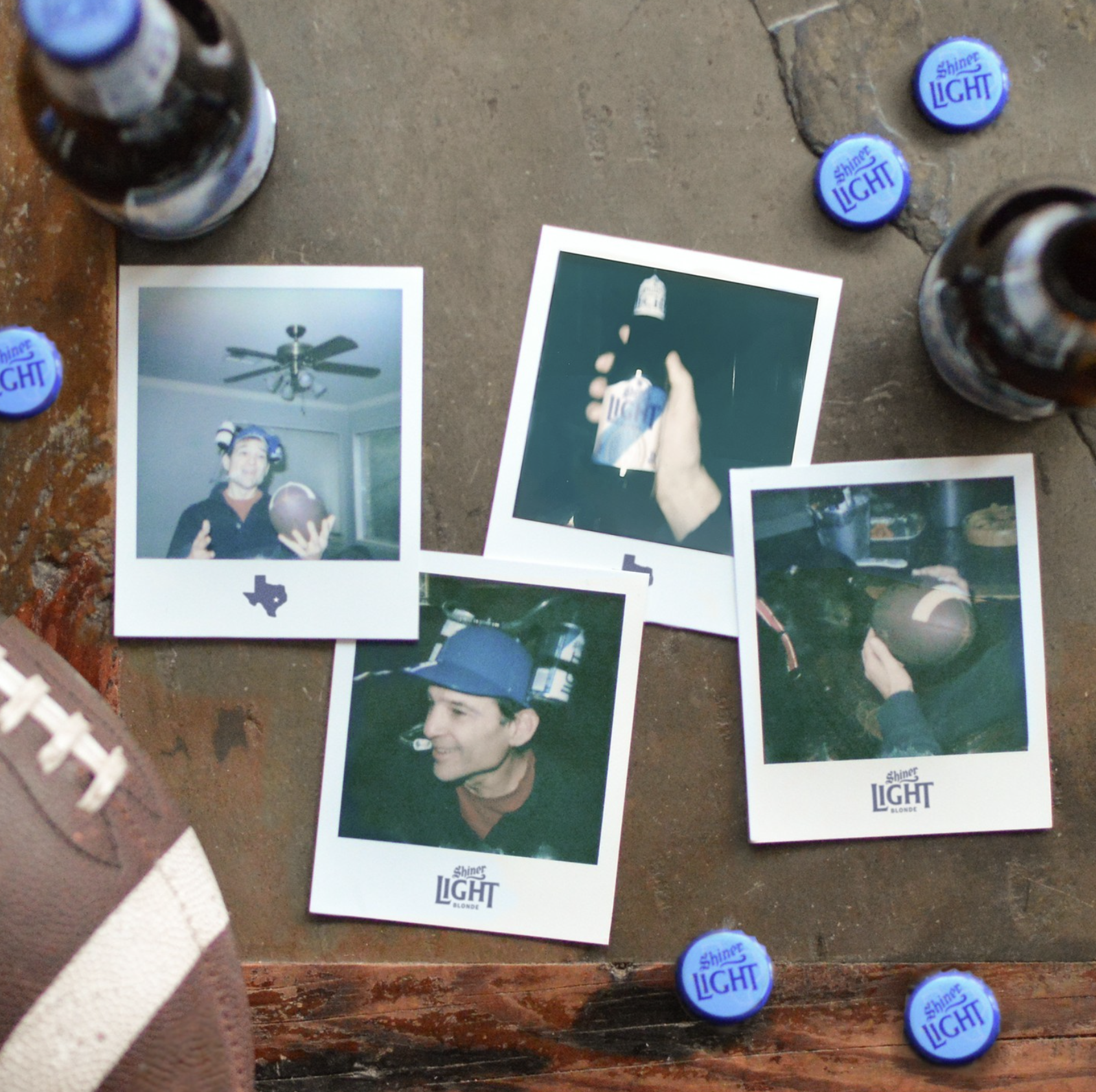
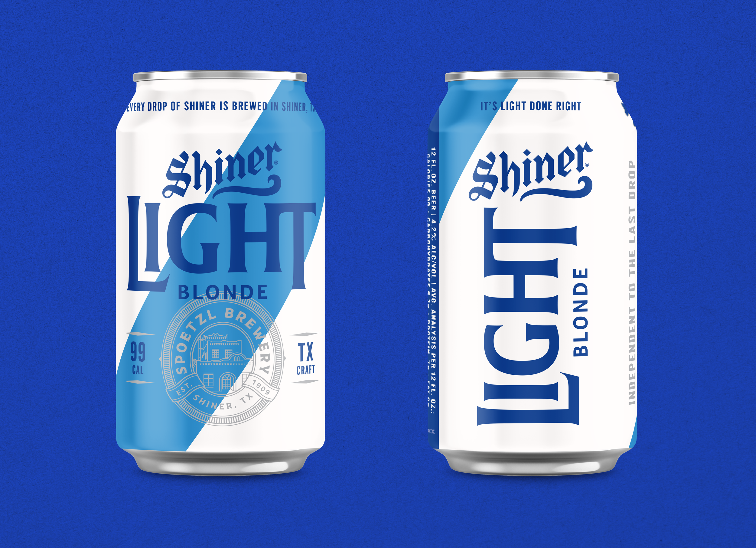
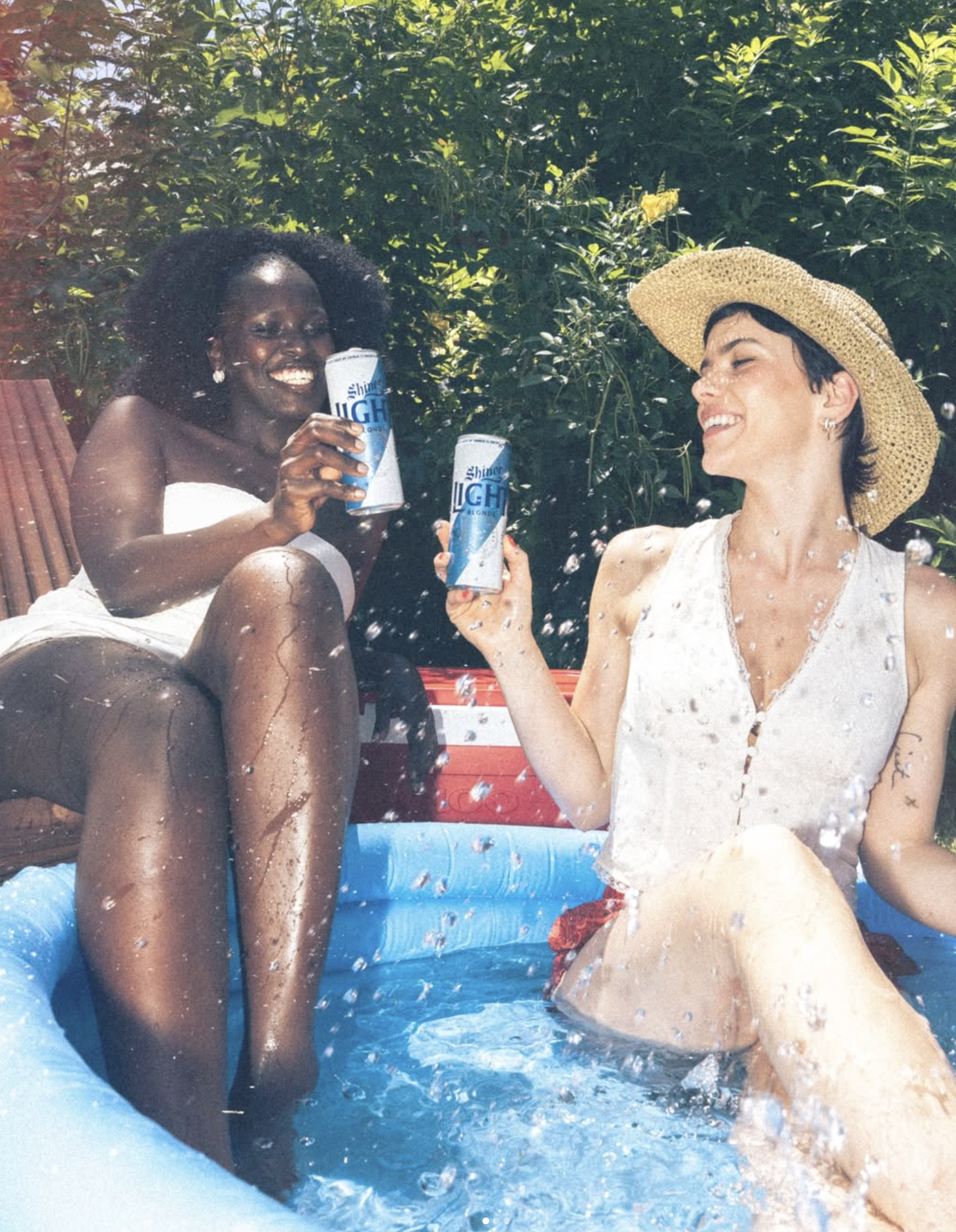
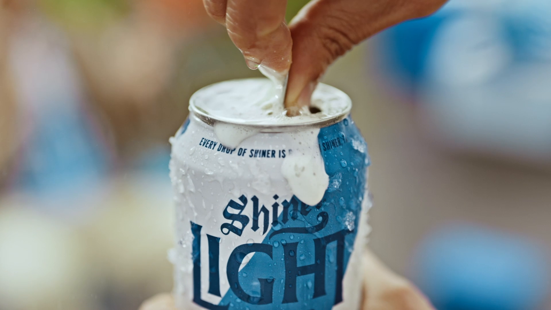
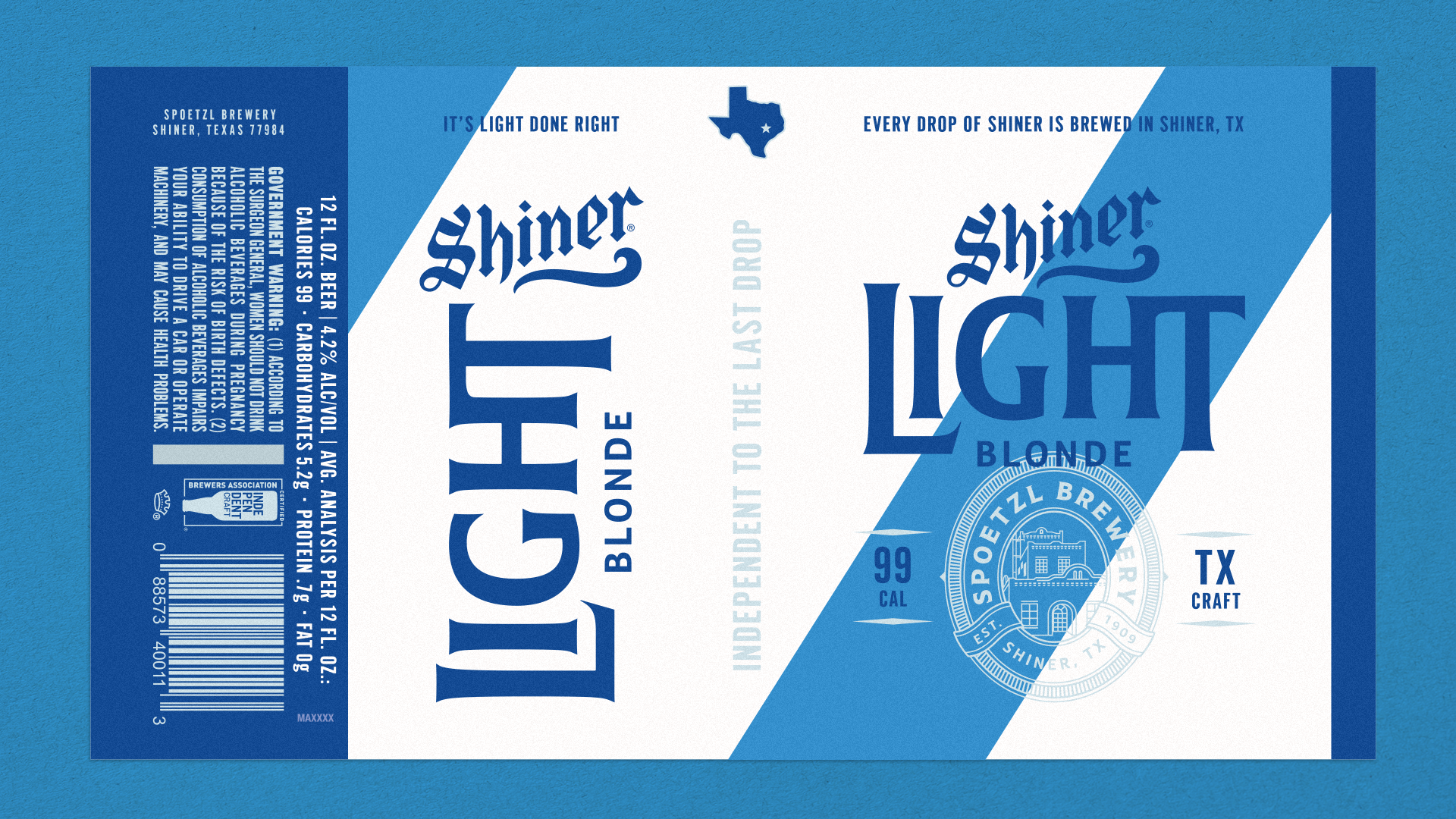
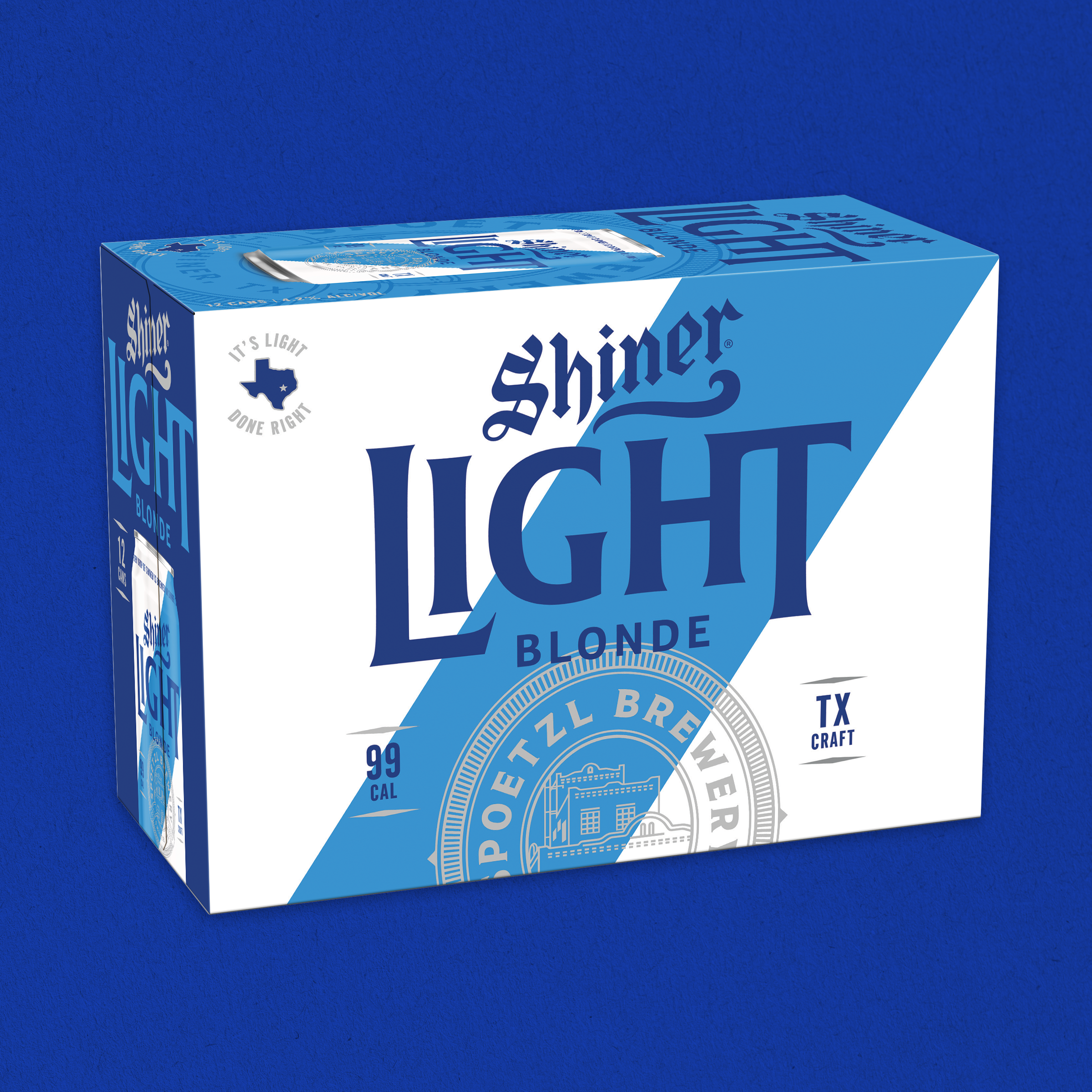
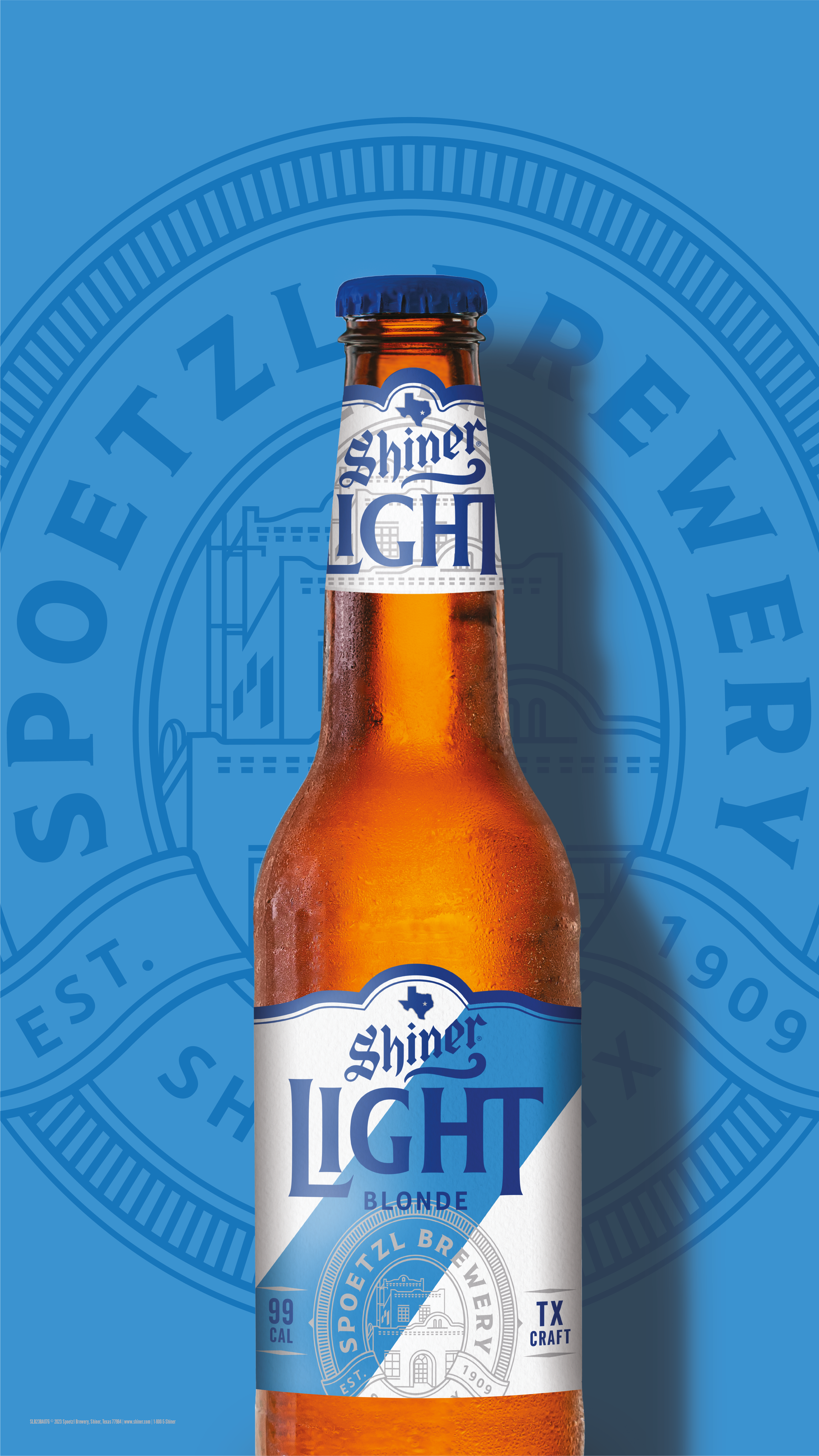
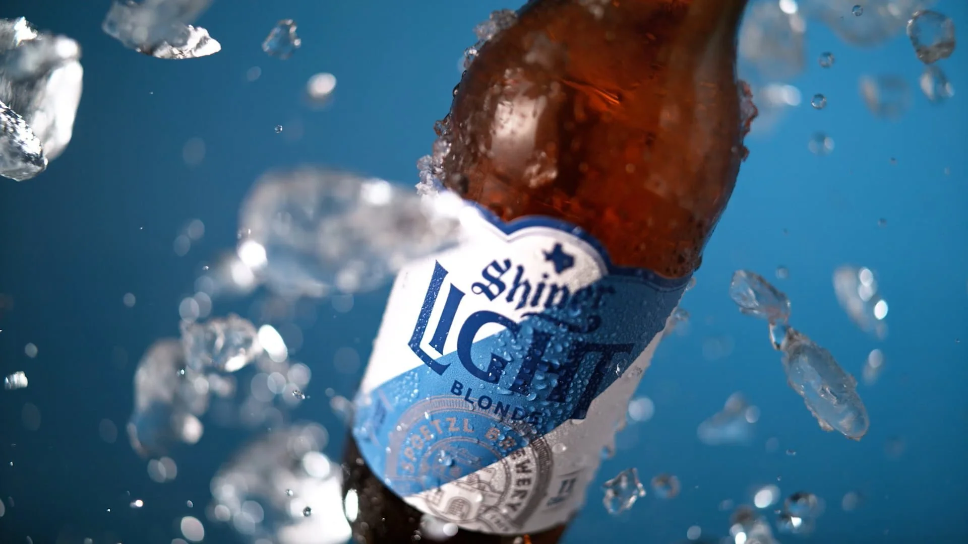
Light Blonde
Led the redesign of Shiner Light Blonde, evolving the product’s visual identity to feel more modern and competitive within the broader beer category.
The previous packaging felt dated and lacked shelf presence, so the approach focused on simplification and clarity. Updated typography, a brighter, more refreshing color palette, and a refined hierarchy help the brand read quickly while reinforcing the beer’s light, easy-drinking profile.
The result is a cleaner, more confident system that aligns with contemporary expectations while still feeling true to Shiner.
Role: Lead Designer