Light
Shiner approached us to redesign Shiner Light Blonde, evolving the beer's visual identity to feel more modern and competitive within the broader light beer category while remaining true to the brand's rich Texas heritage.
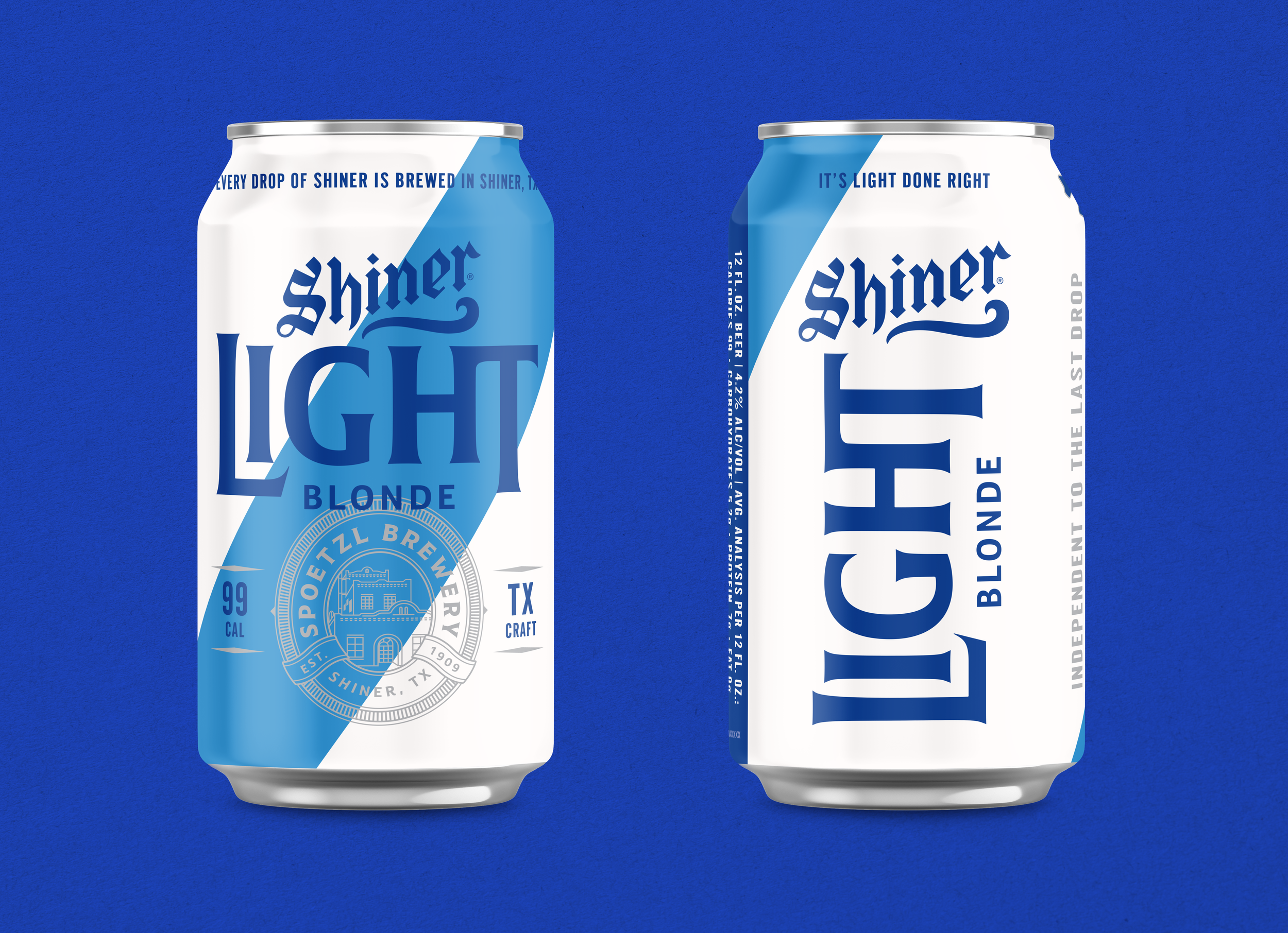
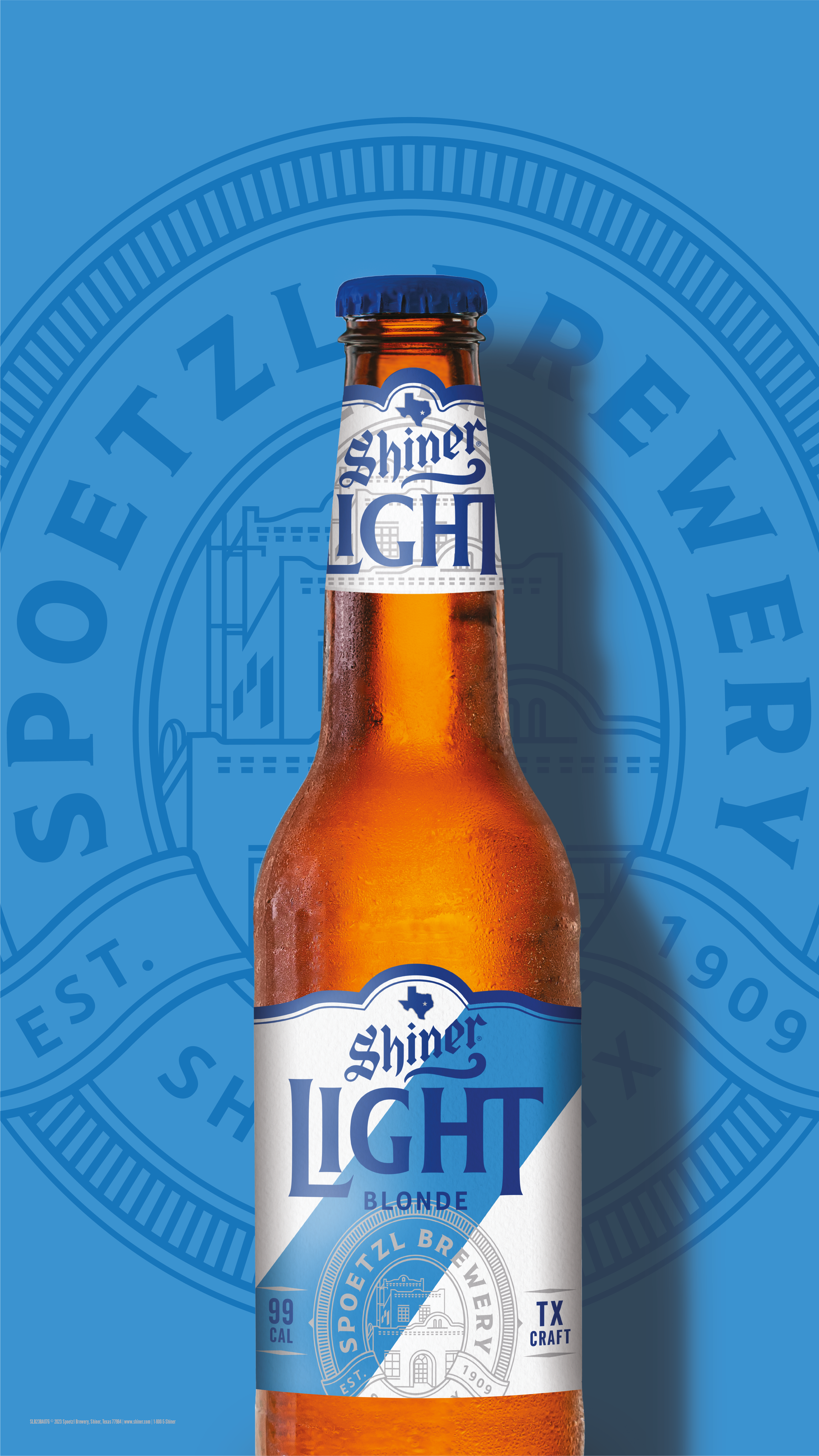
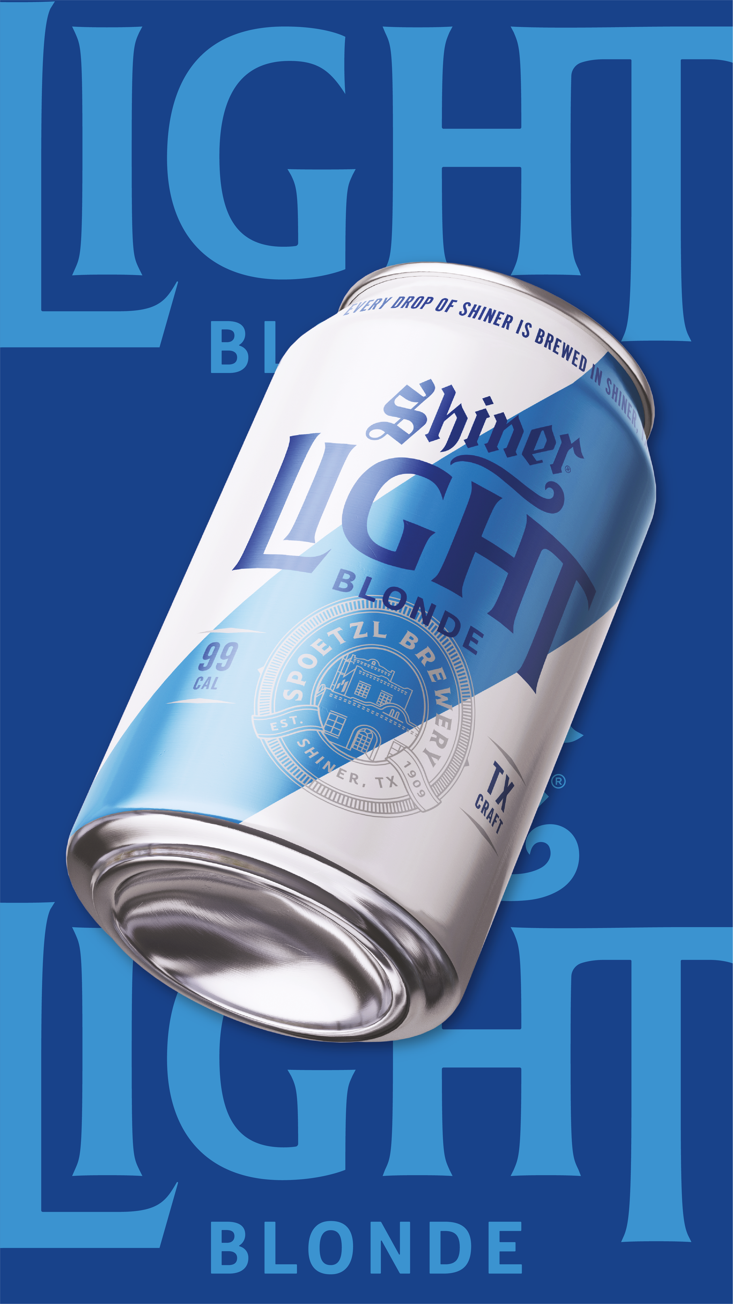
The previous packaging felt dated and lacked the shelf presence needed to stand out in an increasingly crowded market. Our approach centered on simplification and clarity—introducing updated typography, a brighter and more refreshing color palette, and a refined information hierarchy that better communicated the beer's light, easy-drinking personality.


A key objective was honoring the visual equity Shiner had already established. We retained iconic elements such as the prominent diagonal stripe and signature blue palette, reimagining them through a more contemporary lens that felt both familiar and fresh.
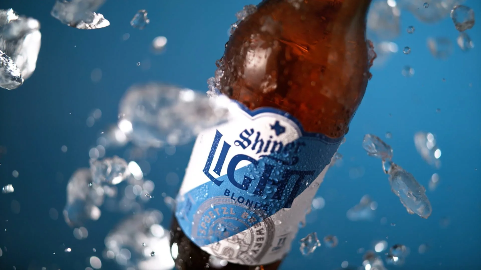
The resulting design system is cleaner, bolder, and more confident; bridging heritage and modernity while giving the brand a stronger presence at shelf and across touchpoints.

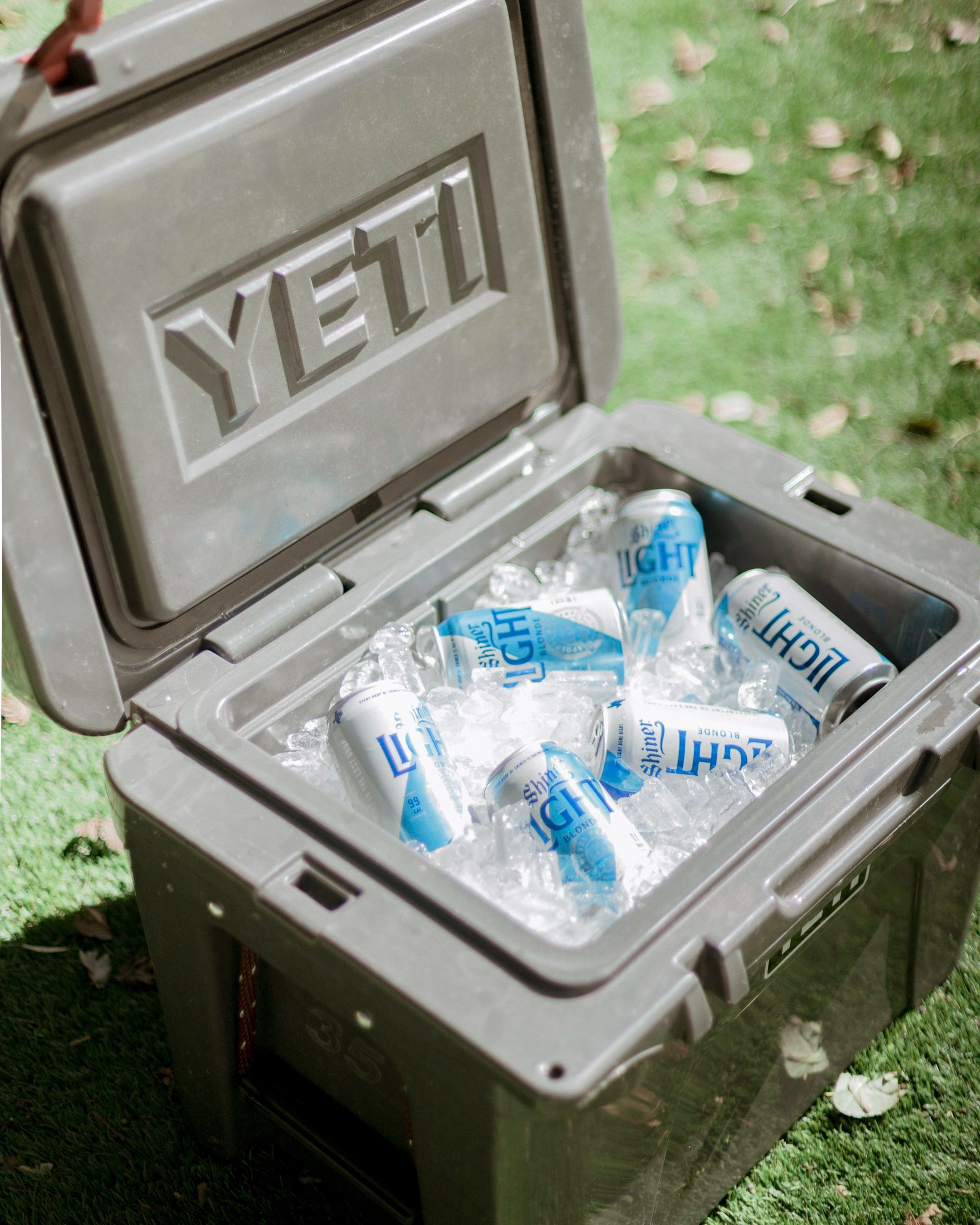
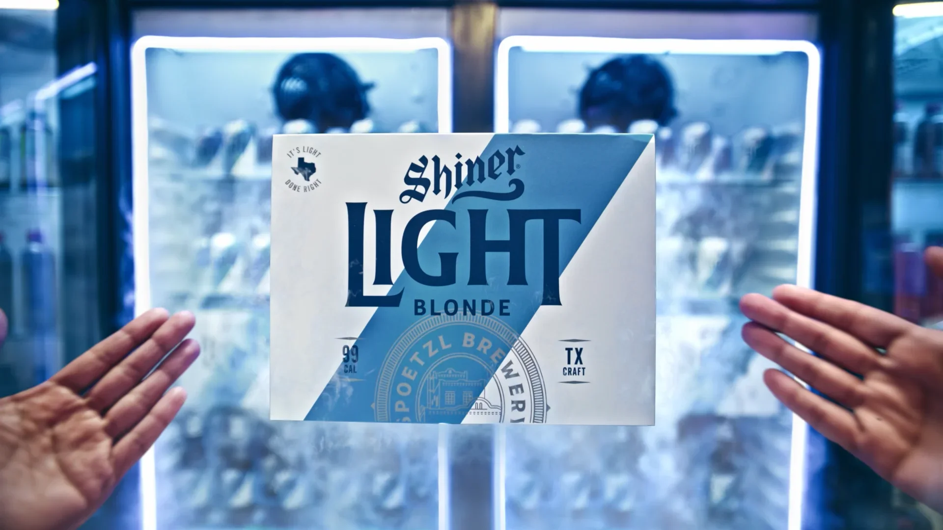
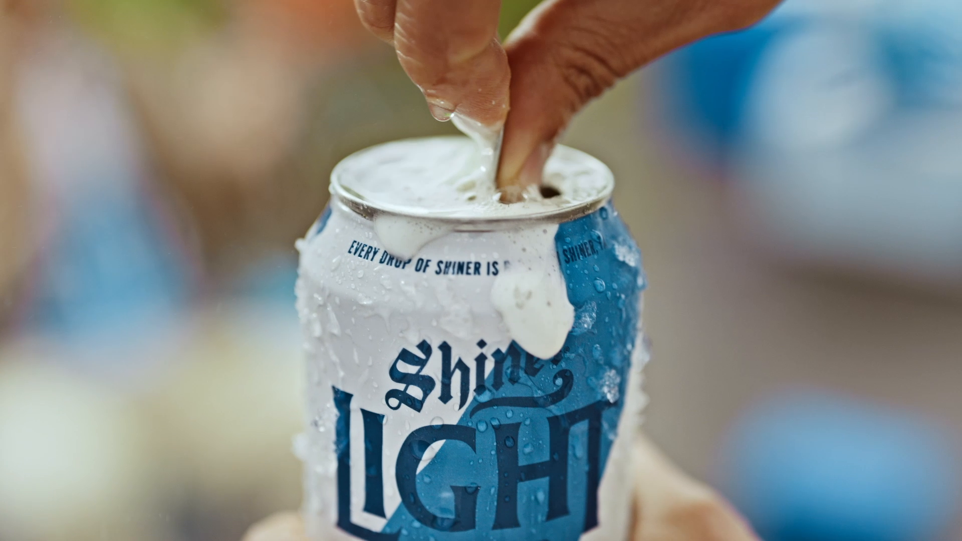
Following the launch, the identity was expanded across the full portfolio of SKUs and became the foundation for a much broader brand ecosystem, appearing across point-of-sale materials, out-of-home advertising, experiential activations, merchandise, and the integrated "How Texas Does Light" campaign, including multiple commercial spots.

Since the redesign, the brand has evolved from Shiner Light Blonde to simply Shiner Light, with the visual identity remaining largely intact. Today, it continues to be one of Shiner's flagship offerings, distributed across the United States and Mexico and prominently featured throughout Texas in retail environments, advertising, and live events.